How to create
print-ready artworks
Creating print-ready artwork is a critical step in producing professional marketing materials. Whether you’re printing business cards, brochures, packaging or large-scale signage, even small technical mistakes can lead to costly reprints, delays, or disappointing results.
This guide explains everything your business needs to know—clearly and in detail—so your designs print exactly as intended.
Print-ready artwork refers to a file that is fully prepared for professional printing, requiring no further adjustments from the printer.
A print-ready file should:
- Be set to the correct size and dimensions
- Use CMYK colour mode
- Include bleed and safe margins
- Contain high-resolution images (300 DPI)
- Have fonts embedded or outlined
- Be exported in a suitable format (typically PDF/X)
If any of these elements are incorrect, your print job may be delayed—or worse, printed incorrectly.
- Let’s break that down.
Work at Actual Size (1:1 Scale)
Always design at the final print size. Resizing artwork later can reduce quality and distort layouts.
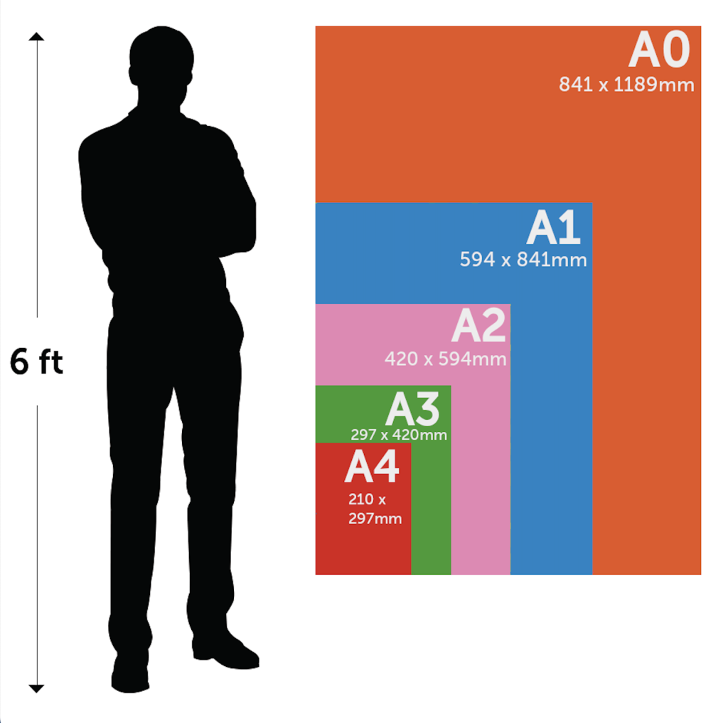
Common UK print sizes include:
- Business cards: 85 × 55 mm
- A4: 210 × 297 mm
- A5: 148 × 210 mm
- DL flyer: 99 × 210 mm
A bleed is the area that extends beyond the trim line, usually by 3mm. It ensures there are no white edges if the trimming is slightly off.
Standard bleed: 3 mm on all sides.
For example, if your final printed size is 100 × 150 mm, your design file should be 106 × 156 mm.
Common bleed issues:
Design stops exactly at the edge
Backgrounds don’t extend far enough
Important text is too close to the trim edge
How to fix it:
Extend backgrounds and images beyond the trim line
Keep text 3–5 mm inside the safe area to ensure nothing is cut off
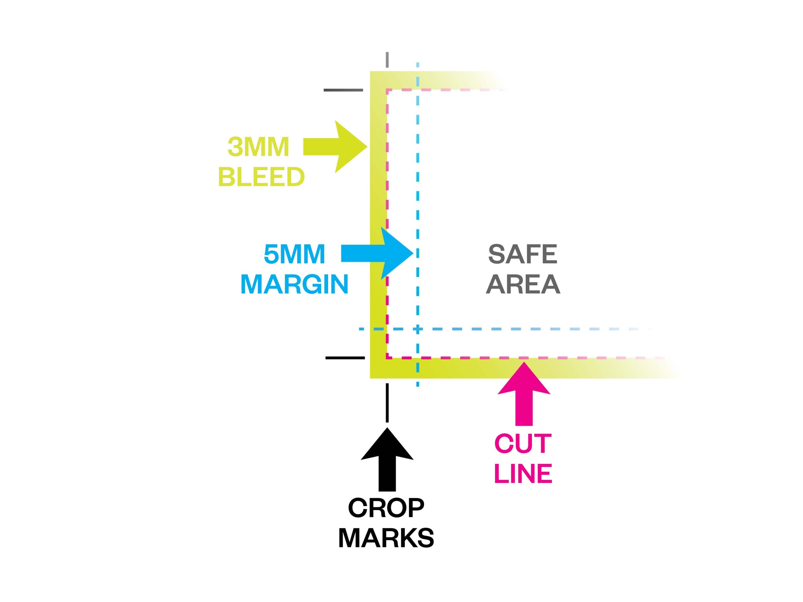
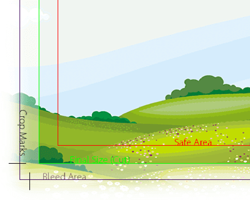
A safe zone is a margin inside your artwork where you keep important elements like text and logos — to avoid them being cut off.
To ensure clean, professional results, your artwork must account for the physical trimming process.
- Bleed: 3 mm beyond the edge of your design
- Trim line: final cut size
- Safe area: keep text at least 3–5 mm inside
Why it matters:
Printing is done in bulk, and slight shifts during trimming are unavoidable. Without bleed, you risk white edges. Without safe margins, important content may be cut off.
Designs for print should always be set in CMYK, not RGB.
RGB (Red, Green, Blue) is for screens, while CMYK (Cyan, Magenta, Yellow, Black) is used by printers.
If you send a file in RGB, the colours might shift — and not in a good way.

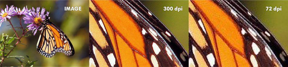
For sharp, professional results, your artwork should be at 300 DPI (dots per inch). Anything lower might look pixelated or blurry in print.
Avoid:
- Screenshots
- Images downloaded from Facebook or Instagram
- Small images stretched larger than their original size
Tip: Always check your images at 100% zoom to see how they will print.
Tip: Avoid upscaling low-resolution images — always start with high-quality assets.
Printers typically prefer PDFs for print jobs, as they preserve quality and are easy to check.
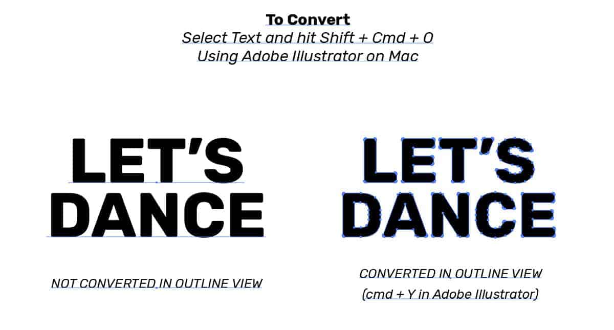
Make sure your fonts are embedded or converted to outlines to avoid missing characters.
Tip: Avoid JPEGs for text-heavy designs — they can compress and blur sharp details.
Why PDF is best:
- Fonts can be embedded
- Colours are more consistent
- Layout remains intact
If you're using custom fonts, embed them in your PDF or convert them to outlines to prevent font substitution. Also, double-check that all your linked images are included and high-resolution.
Tips:
In Adobe Illustrator or InDesign, use the "Package" function to gather all assets.
On Adobe Illustrator: Select vector graphics and use hotkeys – Shift + Command + O to convert, or select then go to the menu and select Menu > Object > Convert to Shape
On Adobe Photoshop: Select text layer graphics then go to the menu and select Menu > Type > Convert to Shape
Before sending your artwork off, do a thorough check:
• Is the spelling and grammar correct?
• Is your file in CMYK colour mode?
• Is there 3 mm bleed on all sides?
• Are fonts outlined, embedded, or provided?
• Are images in high resolution?
• Is all important text inside the safe margin?
• Is the file saved as a PDF (Press Quality)?
If everything checks out, your artwork is print-ready!
Tip: Print a test copy at home, even on regular
paper — it helps you spot issues you might miss
on screen.
Submitting print-ready artwork doesn’t just help us, it helps you.
When your files are prepared correctly, it means:
- Faster turnaround
- More accurate colours
- No unexpected reprints
- Professional, polished results every time
A little preparation goes a long way and ensures your final print looks exactly as you envisioned.
NEED HELP?


OUR CLIENTS